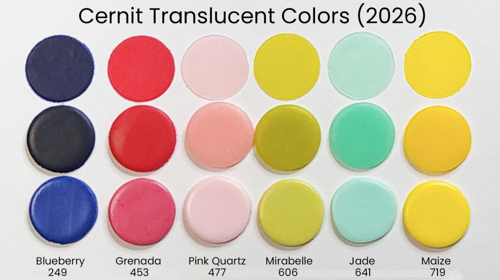
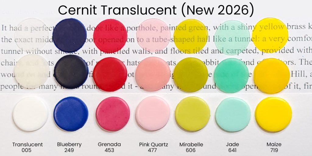
Brand new for 2026, Cernit has six new colors of their excellent translucent polymer clay. If you’re new to Cernit’s range of translucent, go here to read all about it. Today, I’m getting you up to speed on these six new Cernit translucent colors. Say hello to Blueberry, Grenada, Pink Quartz, Mirabelle, Jade, and Maize. Note that some retailers might use different names for these colors, so consult the name/number chart on my article here or check the images below for the color numbers.
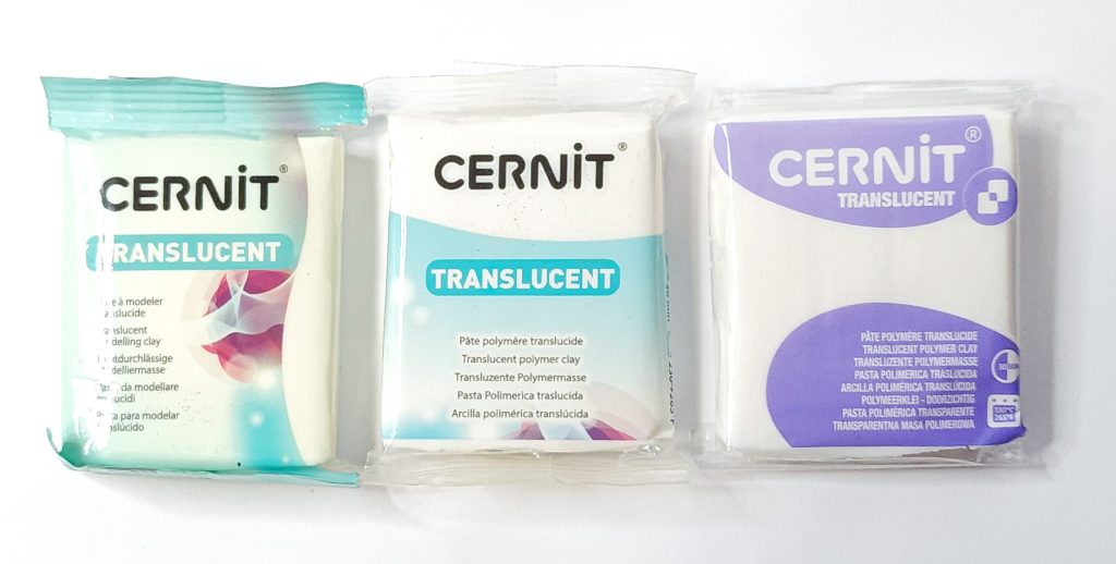
If you haven’t bought Cernit for a while, you might not know that the packaging has changed a bit. It’s now more streamlined with a singular color for each line, making it easy to identify each at a glance. The Cernit Translucent line uses purple.
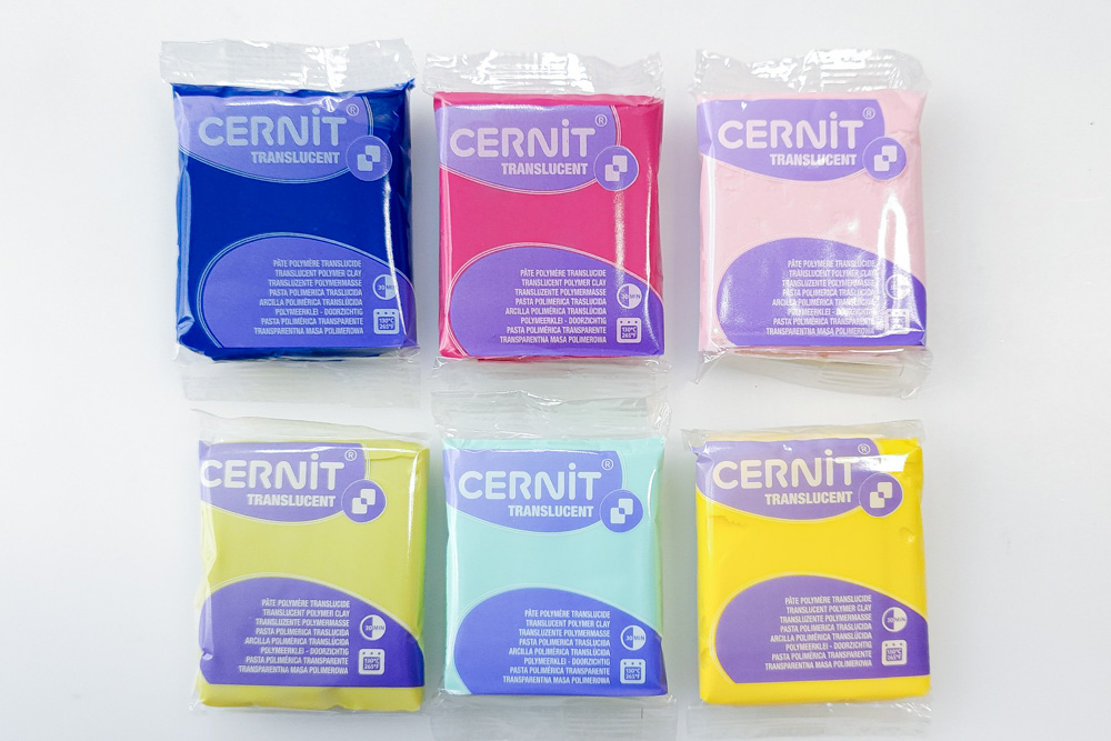
I was a bit surprised by this array of colors, as they don’t look good together in a group like this. The colors don’t relate to each other all that well. BUT, upon closer inspection, I realized these colors are really two clusters.
One cluster is Mirabelle, Jade, and Pink Quartz. They are more delicate colors that will be useful as-is for various projects. And the other cluster is Blueberry, Grenada, and Maize, which are quite neutral standard blue, yellow, and red colors for color mixing.
The Pretty Colors
Mirabelle is an intense yellow green that can’t decide if it’s yellow or green. (Hint, it’s very yellow.) But it’s a nature color, not a bright candy color. This will be perfect for natural-looking spring greens, leaves, and in skinner blends to make the greenish throat of white flower petals. Imagine lilies!
Jade is a light teal color that’s sort of blue and sort of green. It’s the color that I would have called seafoam. It’s more blue than jade typically is. It is a light color, not terribly saturated, and will work well for sea glass. And if you add a tiny bit of Emerald (another Cernit Translucent Color), you’ll get a great jade color.
Pink Quartz is a light pink. Very light. It’s too light for cherry blossoms. It’s a delicate color that is begging to be put into flower form. It does not, however, have any sparkle or shimmer as you might expect from the name.
The Primaries
The Cernit Translucent line has long suffered from a color selection that makes color mixing hard. Previously, the blue was too green, the yellow was dull and nearly orange, and the red was a weird pinky but not magenta. There were many colors that could not be created with Cernit Translucent colors. I’m still not happy with the range from a pure colorist standpoint, but adding these new colors into the range gives us many new color-mixing possibilities.
Grenada is a nice, neutral, rich, and deep cherry red. It’s intensely saturated, and unless you need a DEEP and intense red, you will want to use this as a color concentrate and dilute it with plain translucent.
Maize is a bright, true, neutral yellow. Unlike Amber, which is very warm and somewhat orange, Maize is a clear yellow that will work nicely for color mixing.
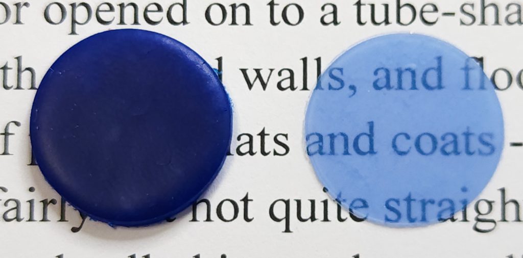
Blueberry is something else. It’s a slightly shaded (black), neutral blue. Not quite an ultramarine blue, but certainly not the greenish blue that Sapphire is. Thing is, it’s dark. It’s so, so, so dark. Blueberry is so deep that unless you dilute it, thick pieces will read as black. Do not use Sapphire undiluted unless you want a nearly black experience! Even when rolled to a #7 thickness on my Atlas, you cannot read text through Blueberry!
Diluting the New Cernit Translucent Primaries
As with many of the colors in the Cernit Translucent line, you should dilute them for best results in most projects. Intensely saturated colors can easily obscure translucency. Here’s what happened when I diluted the new Cernit Translucent primary colors.
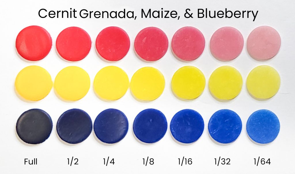
I cannot stress strongly enough how deeply saturated that Blueberry is. Notice how the full strength is nearly black, and it’s STILL quite saturated diluted 1 to 64 parts. Grenada and Maize are also quite saturated, but they’re still usable at higher concentrations.
Here’s a comparison of a #7 thickness (on my Atlas) of both full strength and 1/64 diluted Blueberry.
Where to Buy the New Cernit Translucent Colors
These new colors should be available soon at your favorite Cernit retailer. In the US, you can get these now at Blueberry Beads. In Europe, Hobbyrian is your source. And in Australia, 2Wards Polymer Clay is your go-to.